A Series of Instructional Demonstrations
by Dan Clark
Some Changes, New Features, and Visual Descriptions
Lesson 1
Resources
ZIP file of all resources for lesson 1 (alternatively, download individual files below)
Vocabulary list (lessons 1 – 3)
Windows 11 Orientation Snack Game (lessons 1 – 3)
Back to Windows 11 Training Page
Introduction
Are you a teacher? A parent? A rehabilitation instructor? A web developer or user interface designer? Or are you someone who just wants to know how to accurately describe the different parts of the new Windows 11 experience to others? Maybe you just want to learn more about Windows for your own benefit. No matter your background or motivation, this series of lessons will help by providing you with a solid foundation of the terminology and layout of the new Windows 11 program.
A transcript for this lesson, and all others in this series, is also available for download or viewing.
Objectives
By the end of this lesson, you will be able to understand and be able to discuss the following concepts as they relate to some of the changes and new features in Windows 11:
- Describe the Windows 11 desktop in broad terms
- Describe the new look and location of the Start button, Taskbar icons, and Start menu
- Pinned apps in the Start menu
- Search edit box
- New pinned apps on the Taskbar (Search, Task list, Widgets, and Chat)
- System Tray and Taskbar Corner overflow area
- Widgets board
- Action Center changes
- Snap Layouts and Snap Groups
- Rebranding of Accessibility settings replaces Ease of Access Center
- File Explorer no longer has a ribbon menu at the top
The new design of Windows 11 is fluid and clean-looking, with rounded corners for many windows, tiles, etc.
The Desktop list view is made up of icons or shortcuts to launch apps or open files, folders, etc. These icons can be arranged in various ways, and typically appear in rows and columns. When focus is on the desktop you can press the first letter of an icon to jump directly to that icon. Pressing the same letter cycles through all icons beginning with that letter if more are available. This is a typical Windows list view, and you may use the ARROW keys and other keys to navigate within it.
Some Changes and New Features
In Windows 11, some of the major changes and additions include the following:
- The Start button, Taskbar icons, and Start menu have moved from the left side of the screen to the center. The new theme has rounded corners on many of the dialog boxes and controls, a softer look, and you will hear new Windows event sounds.
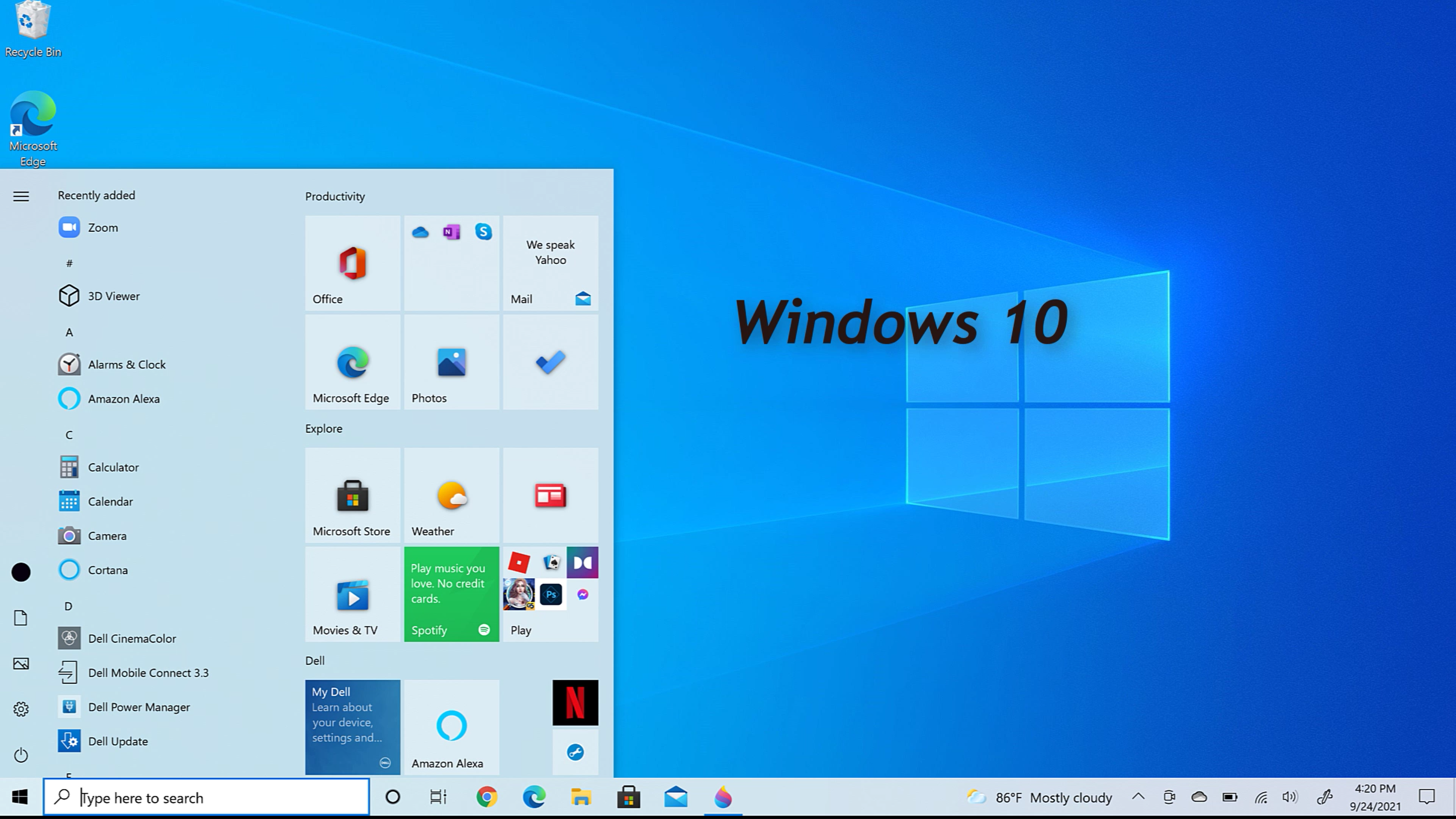
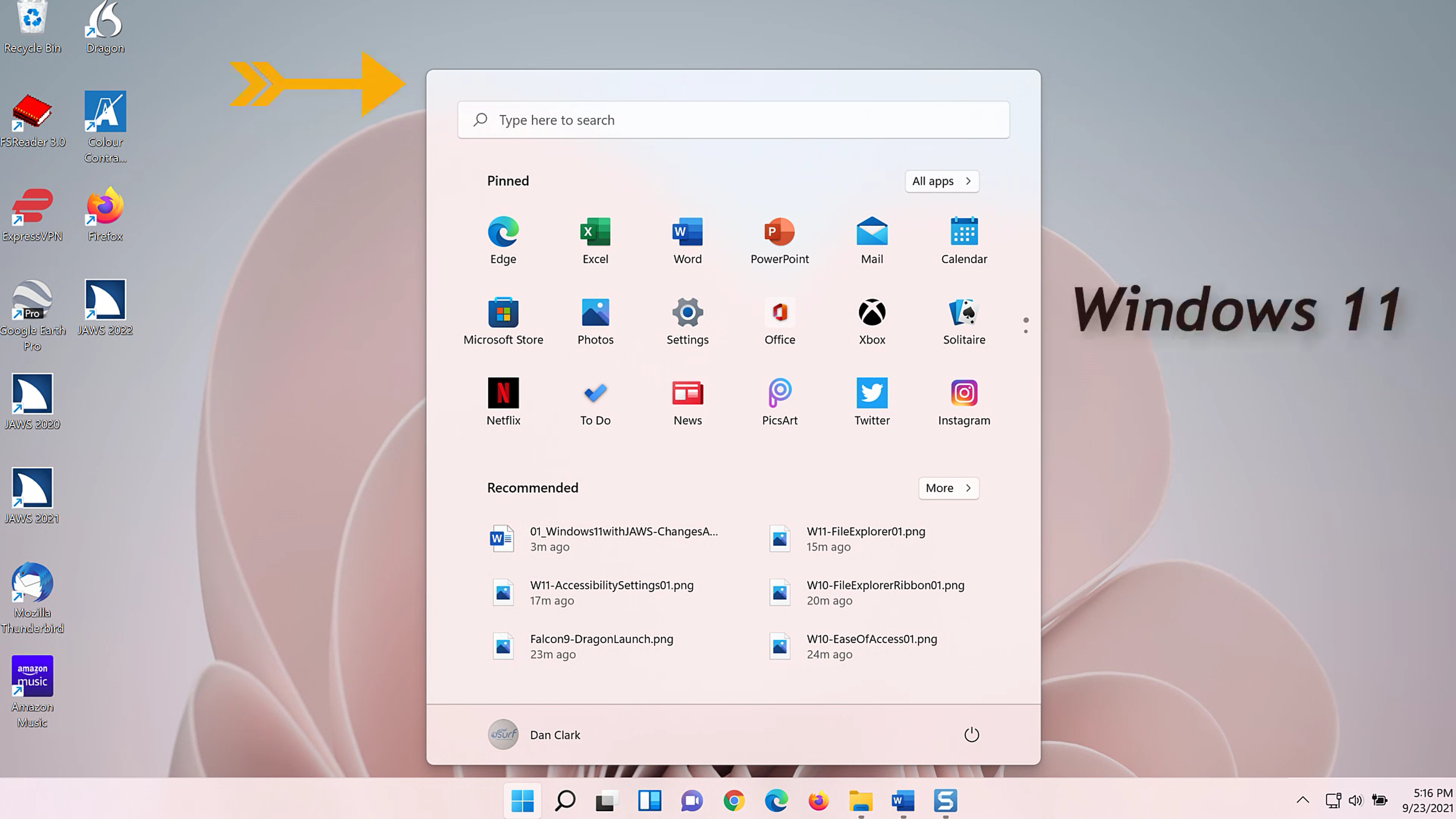
- The Start menu now contains standard icons and no longer uses live tiles.
- The Search edit box is at the top of the Start menu when the Start menu opens. Previously it remained anchored on the Taskbar.
- New icons for Search, Task View, Widgets, and Chat have been pinned to the Taskbar
- There are several changes to the System Tray and Taskbar Corner overflow area
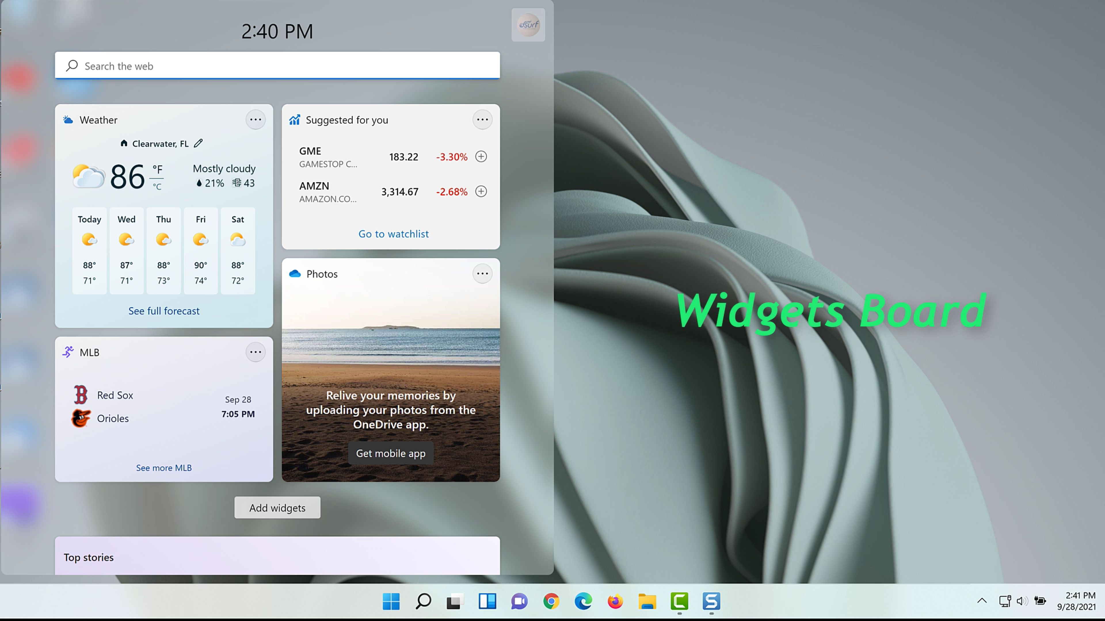
- The Widgets board, a new personalized feed with quick access to news, weather, and other web content, slides out with a one-finger swipe from the left side of the screen
- The Action Center from Windows 10
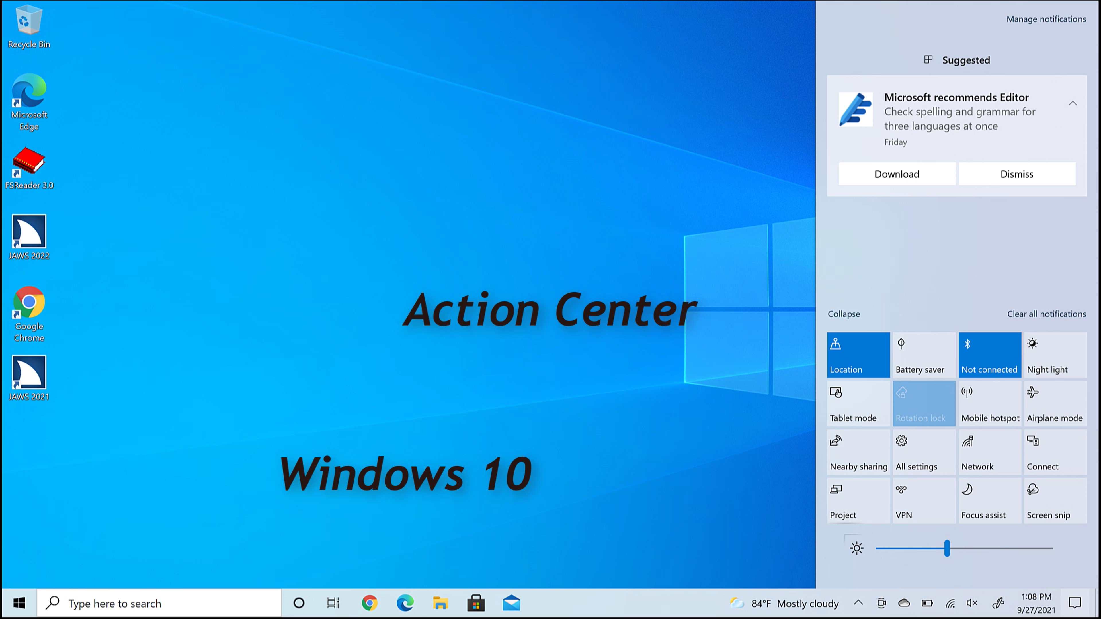
is now split into two separate groups which slide out from the right side of the screen.
They include:
- Quick Settings, which includes wi-fi, Bluetooth, volume, and brightness controls and more.
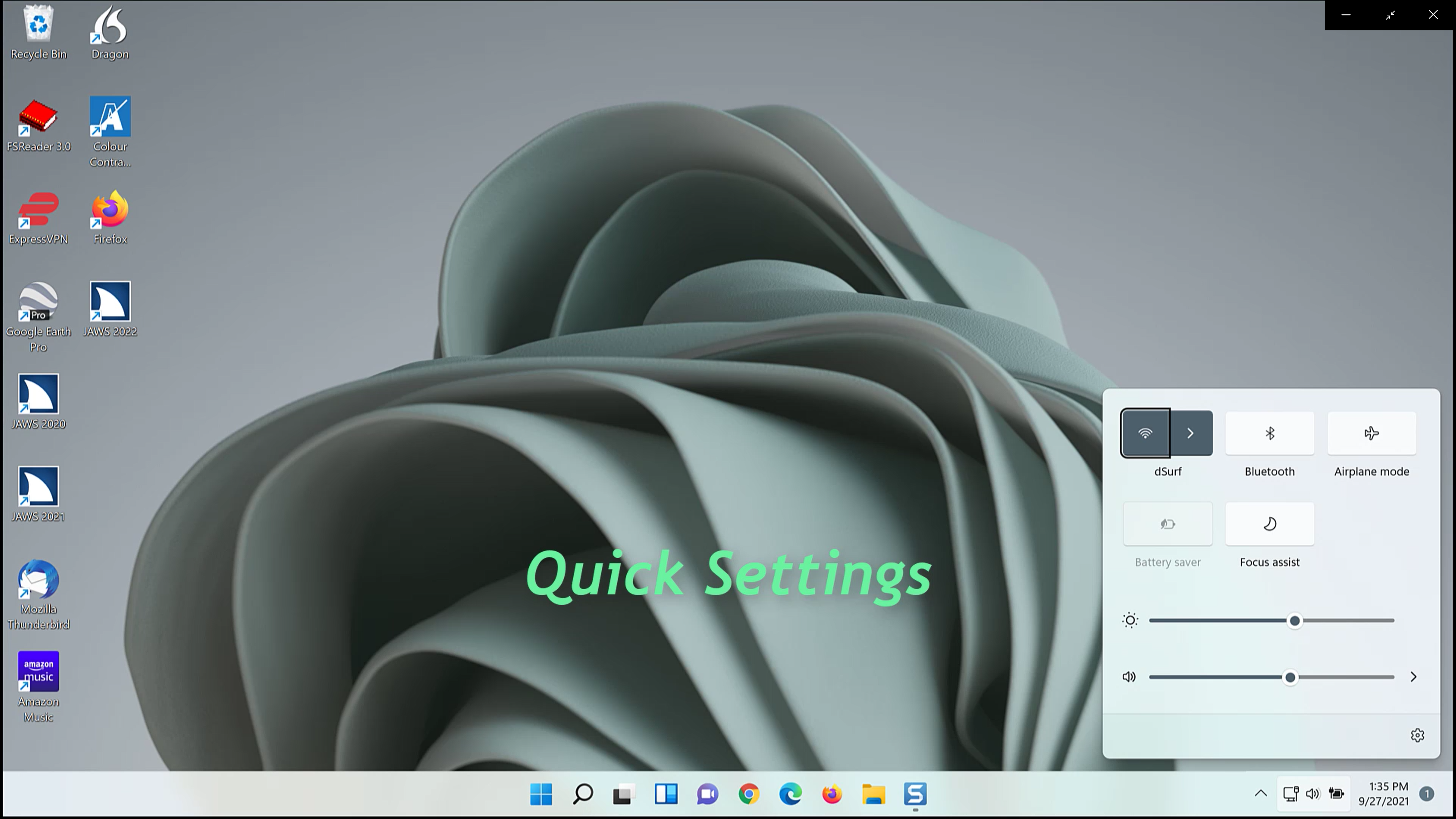
- And the Notifications Center which includes both notifications and the calendar. A single one-finger swipe from the right side of the screen opens the Notifications panel.
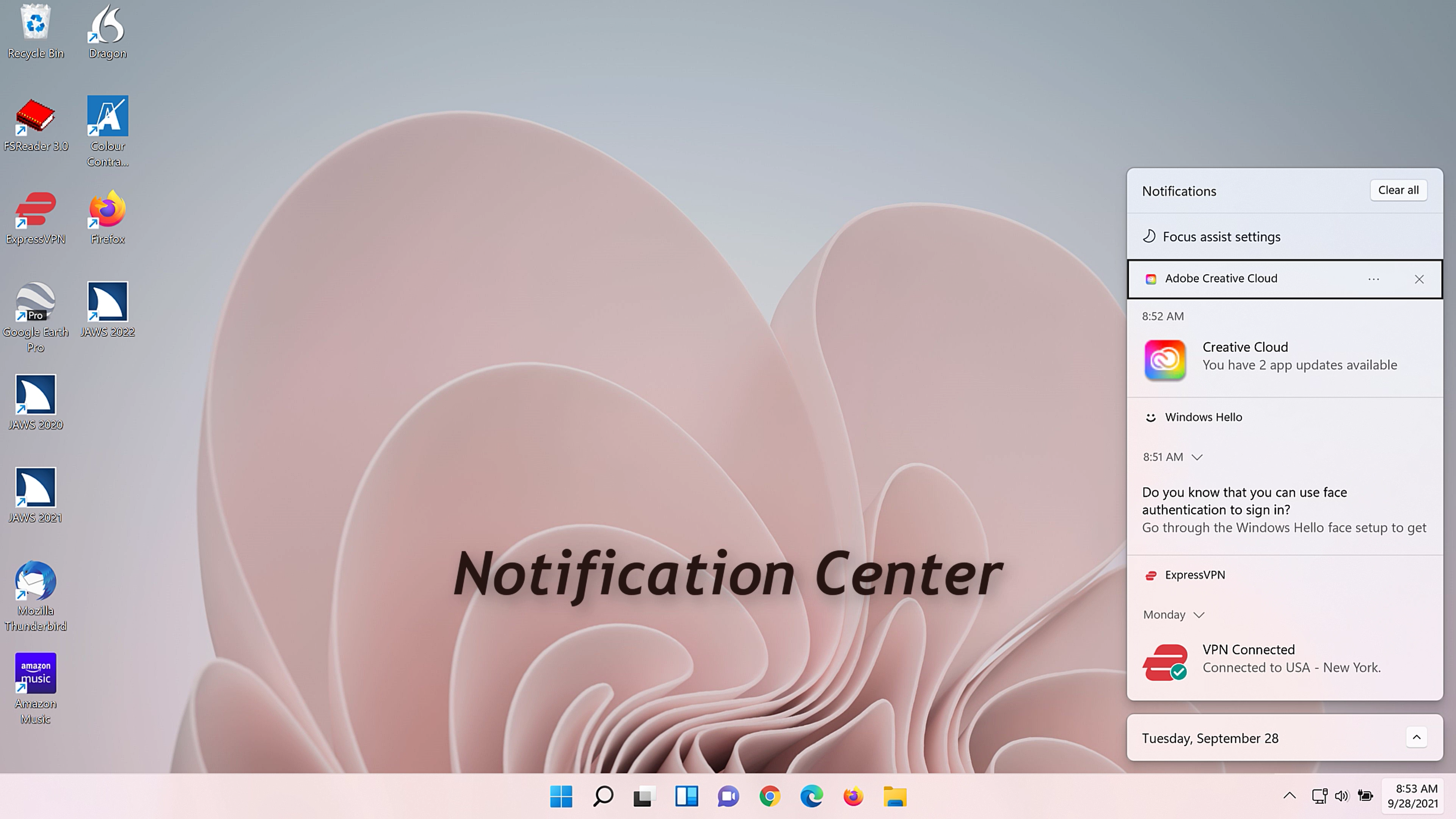
We cover a few basic swipes and gestures in Lesson Four. There are also Windows keystrokes you may use, and we cover many of them in the upcoming lessons as well.
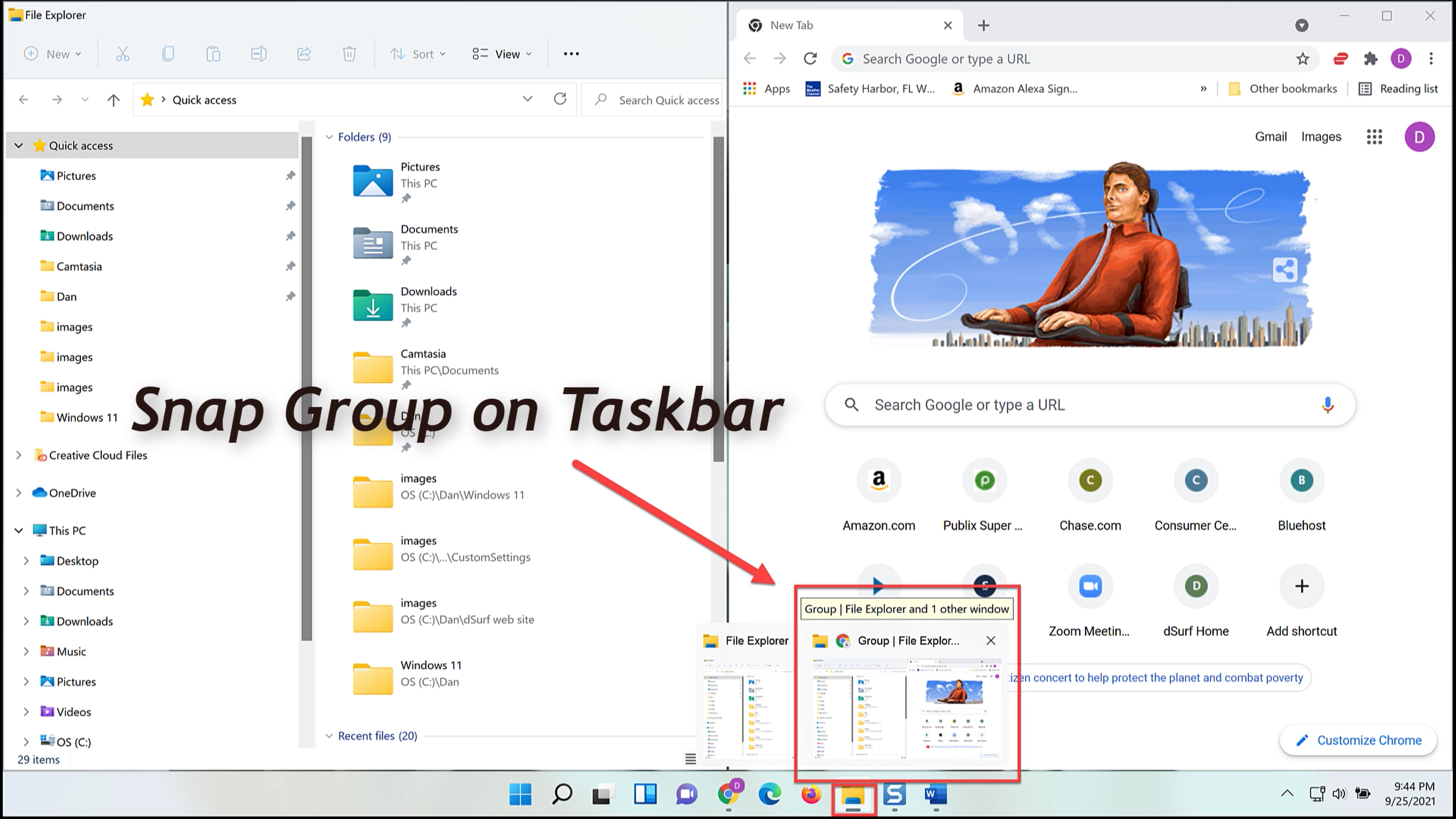
- Snap Layouts and Snap Groups – After you have opened several windows, you can arrange them in groups on the screen.
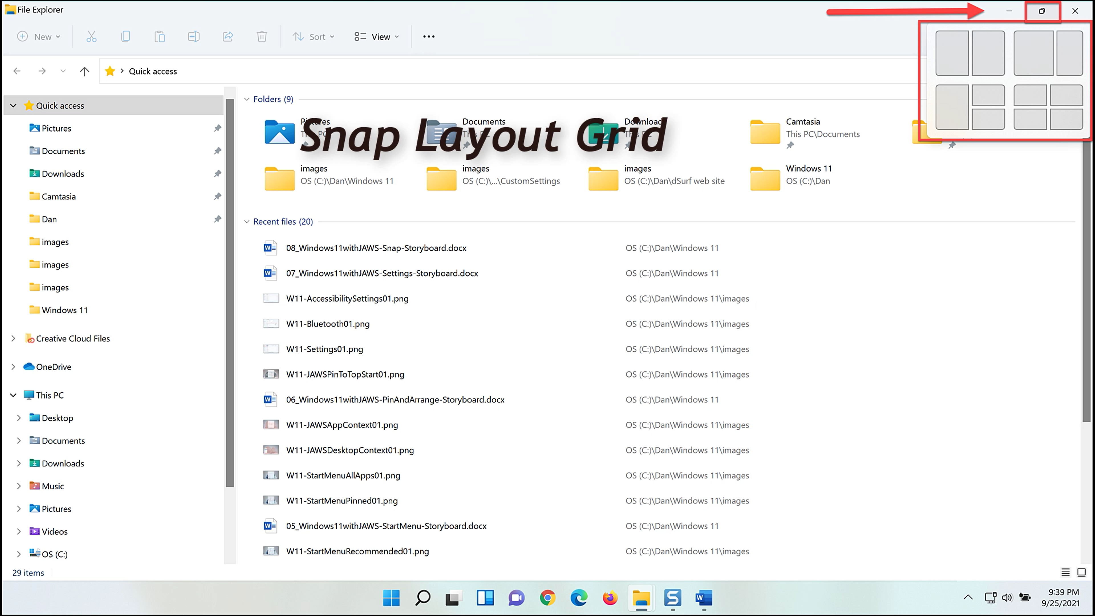
This is like using the WINDOWS key+ARROW keys to snap apps to the left, right, etc. but there are several different options to choose from.
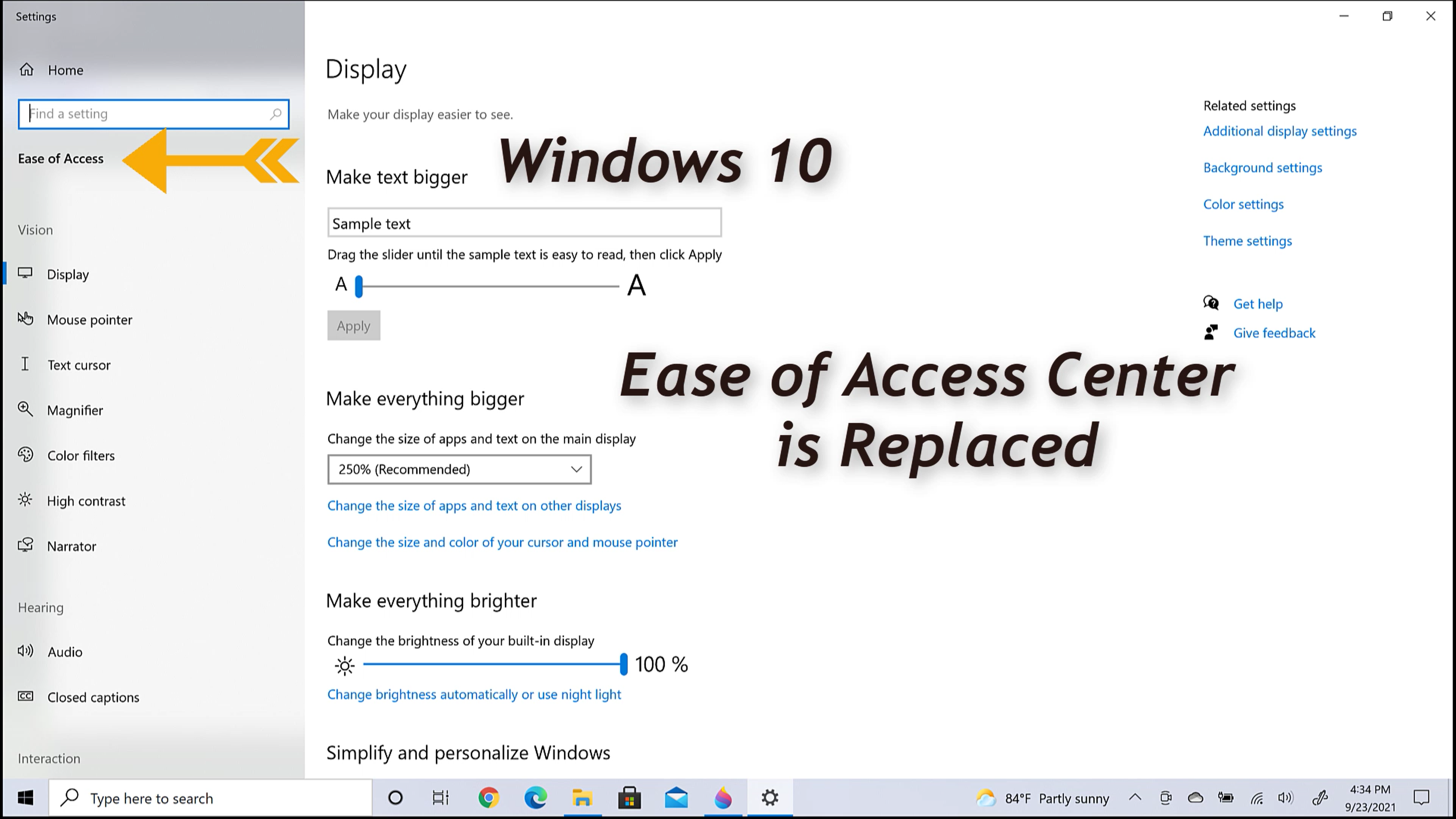
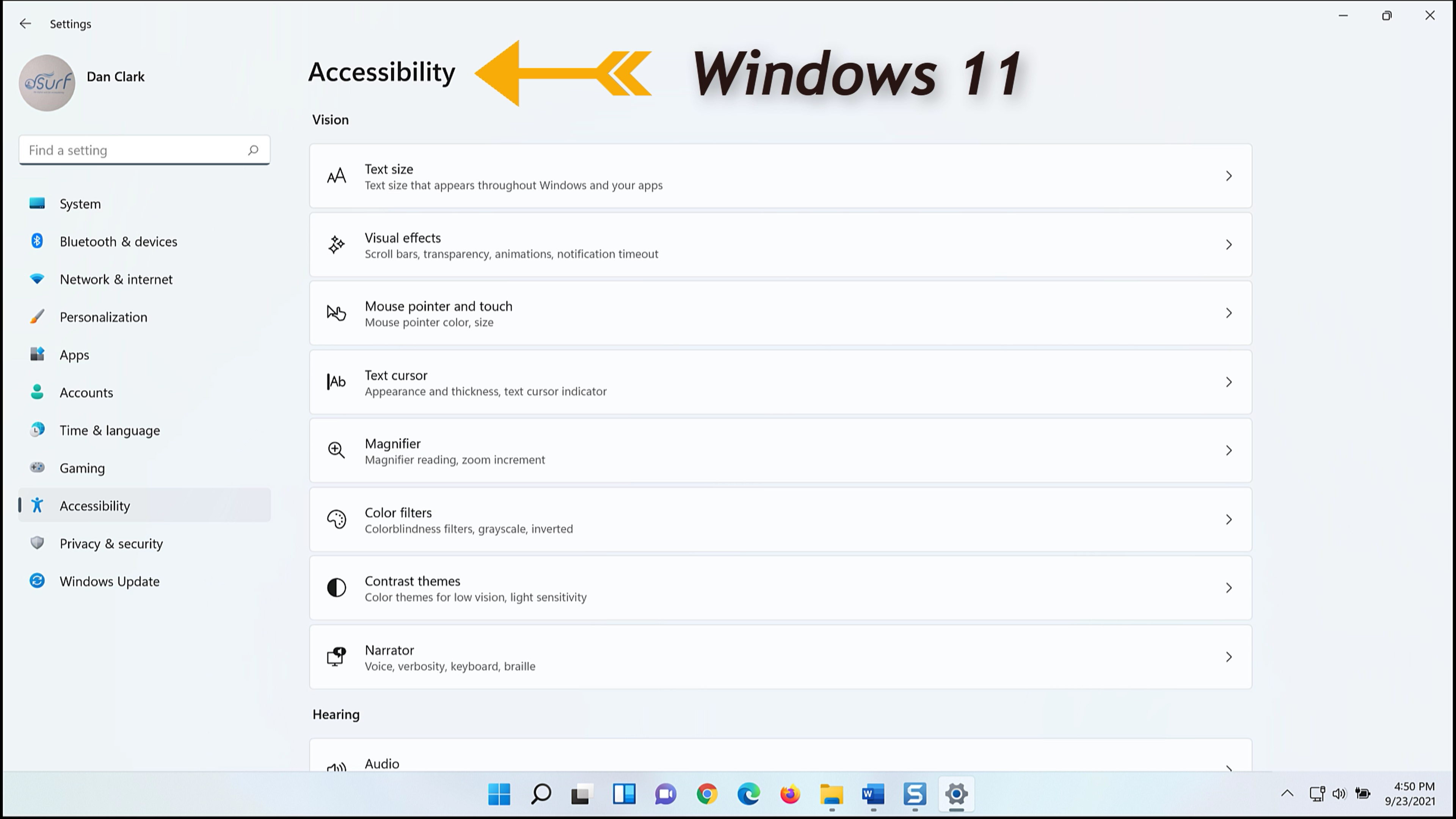
- Windows 11 Settings controls and features have been updated throughout, but one major change has been the rebranding of Accessibility settings, which replaces the Ease of Access center in prior Windows versions.
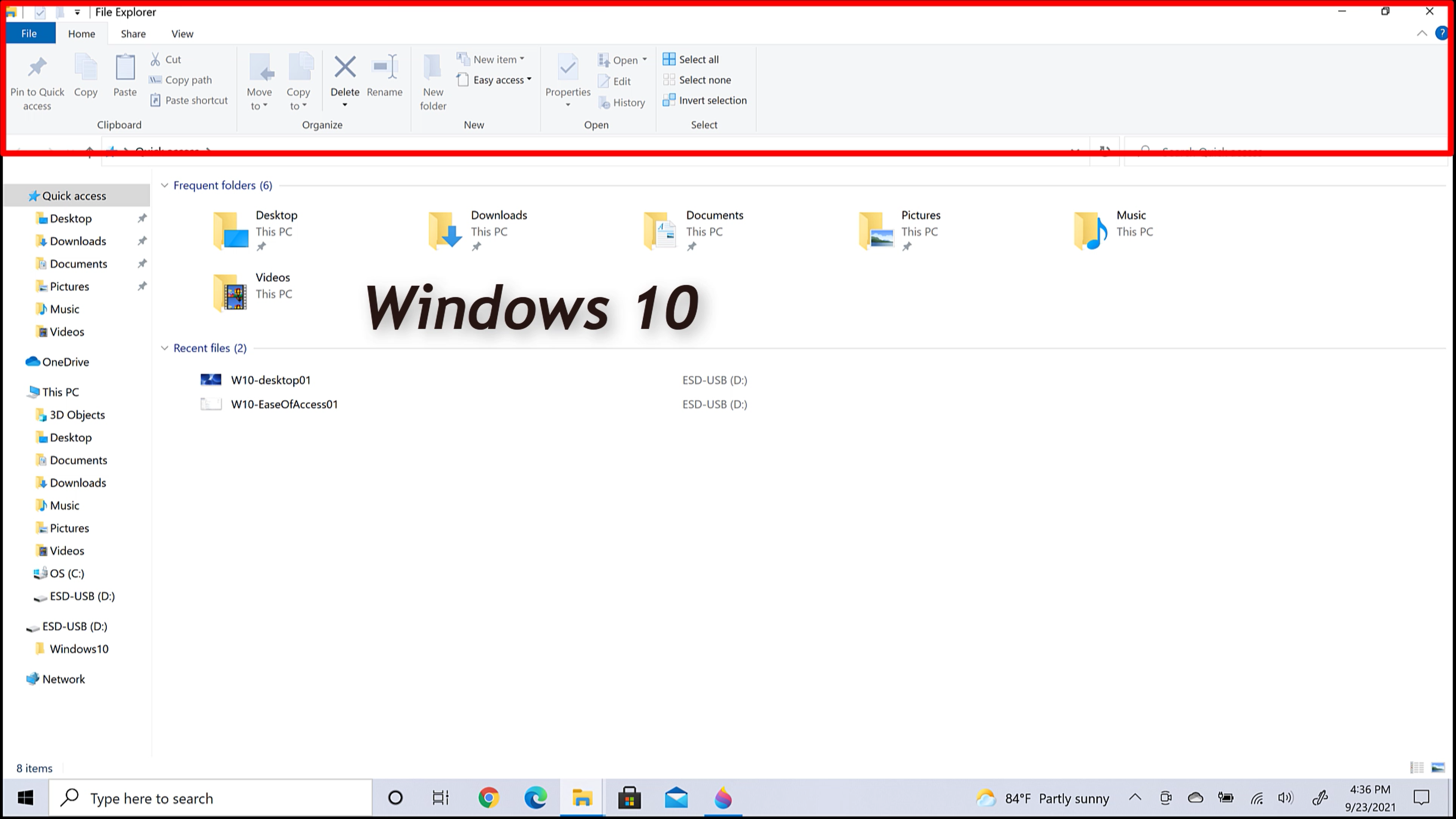
- In another subtle change, File Explorer no longer has a ribbon menu at the top.
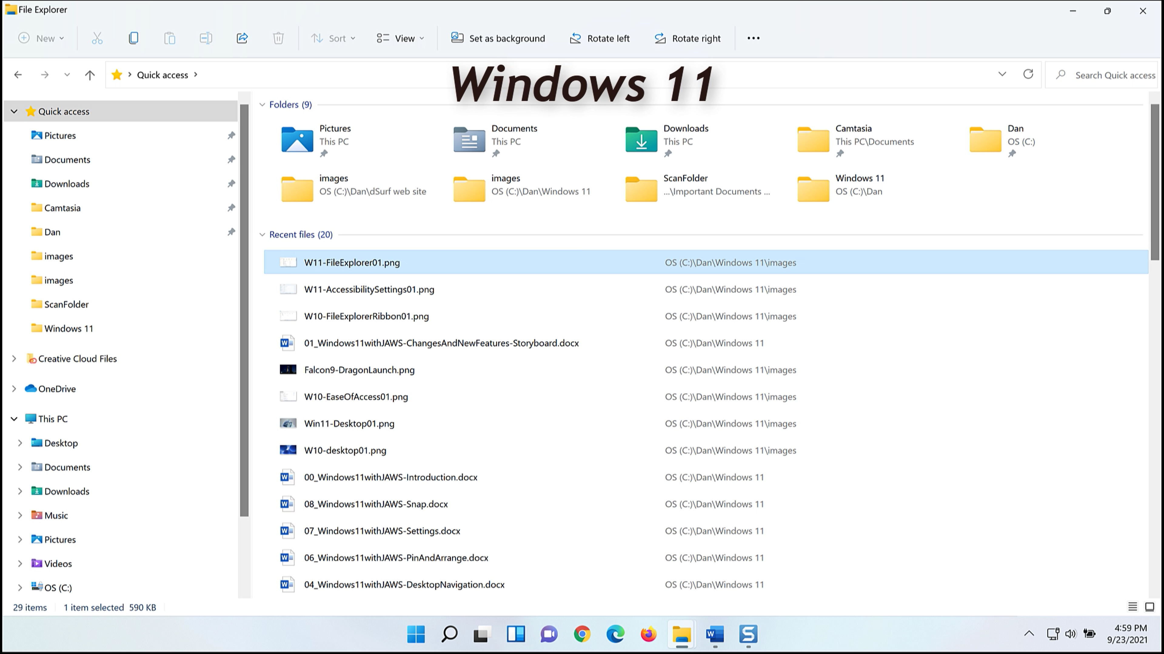
- And there is, of course, much more!
In summary, the Windows 11 interface is uncluttered, with three main areas:
- A list view grid of icons to launch apps, files, and more takes up most of the screen.
- Centered on the Taskbar is a cluster of icons including the Start button, pinned items, and running apps.
- On the right side of the Taskbar is the Taskbar Corner overflow and System Tray.
In the remaining lessons for Windows 11 with JAWS we cover these topics and more in greater detail.
Thank you for joining me in this overview of some of the changes and new features in Windows 11. I hope you will join me for the remaining lessons.

